Classification performance of some laboratory test or statistical model which categorizes cases into one of two groups can be evaluated by ROC (Receiver Operator Characteristics) curve procedure. It produces useful statistics and tool of visualization as ROC curve graph.
Let us consider several terms.
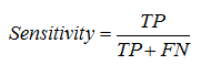
Sensitivity – is the probability that a “positive” case is correctly classified:
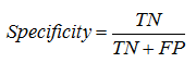
Specificity – is the probability that “negative” case is correctly classified:
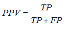
Positive predictive value (PPV) – is a proportion of real “positive” cases among positive results of test:
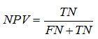
Negative predictive value (NPV) – is a proportion of real “negative” cases among negative results of test:
Likelihood ratio positive = sensitivity / (1 − specificity).
Likelihood ratio negative = (1 − sensitivity) / specificity.
False negative rate is 1-sensitivity.
False positive rate is 1-specificity.
The most common application of these statistical parameters is the assessment of some laboratory test to diagnose presence and absence of a disease. If a test has high sensitivity it means that negative result would suggest the absence of disease (amount of false negative results is low). If a test has high specificity it means that positive results would suggest the presence of disease (amount of false positive results is low).
Relations between sensitivity and specificity
|
|
True class (observed)
|
|
|
Positive (1)
|
Negative (0)
|
|
|
Hypothesized class (predicted)
|
Positive (1)
|
True positives (TP)
|
False positives (FP)
Type I error
|
PPV=
TP/(TP+FP)
|
|
Negative (0)
|
False negatives (FN)
Type II error
|
True negatives (TN)
|
NPV=
TN/(FN+TN)
|
|
|
|
Sensitivity=
TP/(TP+FN)
|
Specificity=
TN/(FP+TN)
|
|
ROC curve procedure calculates sensitivity and 1-specificity for every cut-off of diagnostic test and builds curve based on these calculations:

Thus, ROC curve allows:
1) to assess diagnostic accuracy of the test,
2) to choose the most optimal cut-off of the test,
3) to compare diagnostic accuracy of several tests.
Diagnostic accuracy of the test is assessed by the area under the ROC curve – AUC (Area Under the Curve). A perfect test will have the AUC 1.0 while AUC 0.5 indicates that using the test is the same like guessing by chance. Usually results fall between these two values.
There is no strict agreement between researchers how to assess AUC values and therefore there are several classifications. One of proposed classifications defines AUC values in the following way:
AUC 0.9-1.0 indicates high accuracy of a diagnostic test,
AUC 0.7-0.9 – moderate accuracy,
AUC 0.5-0.7 – low accuracy,
AUC 0.5 – a chance result.
The closer the curve is located to the upper left corner of the graph, the better is its classification power. On the figure above the best accuracy can be achieved by the test “A”, while results for the test “C” are the worst among these three compared tests. AUCs for variables A, B and C are 0.9, 0.81 and 0.76, respectively.
ROC curve analysis in SPSS
During developing the Logistic regression model for prediction of presence of infection in patient with pancreonecrosis (see Example 8), we have selected to save the probabilities calculated by the model for each observation. These probabilities are saved as a variable “PRE_1” in the Data Editor:

Now we can perform ROC curve analysis using these probabilities in order to evaluate accuracy of classification of cases by our model. At the same time, we may assess classification obtained by using original values of, for example, SAPS III for prediction of presence of infection and we can determine cut-off values for this parameter.
To start ROC curve analysis:
1. Click the Analyze menu and select ROC curve… :

The ROC curve dialog box opens:

2. Select test variable (which classification characteristics we are going to evaluate – “Predicted probability…” and “SAPS III”, click the upper transfer arrow button  . The selected variables are moved to the Test Variable: list box.
3. Select the state variable (which we are predicting – “Infection”), click the lower transfer arrow button . The selected variable is moved to the State Variable: list box.
4. Type “1” at the Value of State Variable type box (this indicates which value of dependent variable equal to 1 corresponds “positive” results).
5. In the Display section by default only the ROC Curve check box is selected. Select also other 3 check boxes.
6. If to click the Options… button the ROC Curve: Options dialog box opens, where we can change different options for analysis:

However in our example there is no need to change default settings.
7. In the main dialog box click the OK button. The Output Viewer window opens with results of ROC curve procedure.
The Output Viewer window contains the Case Processing Summary table which lists number of positive and negative cases, the ROC Curve chart, and two more tables - Area Under the Curve and Coordinates of the Curve:

If we have two or more curves and it is necessary to publish ROC curve chart in black-and-white view, it is better to change type of one of the curves. Double click the chart; the Chart Editor opens:

Double click the target line, the Properties dialog box opens, where change Style of the line and click the Apply button:

Then close the Chart Editor and updated chart appears in the Output Viewer window:

During looking at the ROC curve chart we may notice that “Predicted probability” variable possibly provides better classification then “SAPS III”. But for definitive conclusion it is necessary to look at the table Area Under the Curve:

AUC for predicted probability is 0.754 and for SAPS III is 0.701, that is value for the first variable is slightly higher. However, looking at confidence intervals we can see that more probably differences between these AUCs are not significant because confidence intervals are largely confluencing. AUCs always should be provided with 95% confidence intervals which indicate the interval in which 95% of all estimates of AUC will fall if the study will be repeated again and again.
Finally, the table Coordinates of the Curve provides information for selection of optimal cut-off value:

It lists all possible cut-offs and correspondent sensitivity and specificity achieved by using this cut-off. For example, when we accept cut-off value of variable “Predicted probability” as “0” (we will define all patients as belonging to infected group) then sensitivity will be 1.0 and specificity 0 (because 1-specificity = 1). When we choose cut-off value of 0.5 sensitivity will be 0.915 and specificity 1-0.714 = 0.286. If we look back into the results of logistic regression modeling, particularly, at the table with classification results, we can see that this figure corresponds the number of correctly classified negative cases, because in logistic regression cut-off 0.5 is used by default. Scrolling down this table we can see that with an increase in cut-off value sensitivity gradually decreases while specificity increases:

For example, if we accept cut-off value of 0.63 (that is, all patients who have result of logistic model 0.62 or higher we will define as those who most probably have infective form of pancreatitis), sensitivity will be still rather high – 0.745 but at the same time specificity would be also satisfactory – 0.619. Therefore, studying this table we may choose the most appropriate value depending on what we want to increase in our diagnostic test or statistical model – sensitivity or specificity.
Further scrolling down the Coordinates of the Curve table we will reach results for the variable “SAPS III”:

The most optimal balance between sensitivity and specificity is near 50 points. If we choose cut-off value “49.5” then sensitivity will be 0.574 and specificity 1-0.429 = 0.571, and if we choose cut-off value “50.5” then sensitivity will be 0.553 and specificity 1-0.286 = 0.714. It looks like cut-off value “50.5” is more rational because minor decrease in sensitivity leads to great increase in specificity of the test, however, final decision depends on practical situation: what is more desirable, to reduce amount of false-negative or false-positive results.
When it is very important not to miss a diagnosis (for example, disease with high mortality but the treatment is available), a test with high sensitivity is needed. However, when there is a high cost of false-positive diagnosis (for example, psychological problems in patient with non-curable disease), a test with high specificity is necessary (Akobeng et al., 2006).
ROC curve analysis is more specific for biomedical researches and because of this some specialized software was developed which provides more options for this statistical procedure. For example, MedCalc® program (http://www.medcalc.org/) has tools for comparison of up to 6 ROC curves computing z-statistics and p-values, and also has automatic mechanism of selection the most precise cut-off value.